The products we own and operate
- A portfolio of 6 live SaaS products, plus free decision solvers
- Focused, decision-first tools with no signup to try them
- Each product carries its own name, endorsed "by Loomstrat Labs"
 Brand guidelines · v1.0
The rules for how Loomstrat looks, sounds and ships, across the site, Labs products, Studio proposals and anything with our name on it.
Our team, contractors, partners and press. If you're making something that says Loomstrat, start here.
Every approved logo, as SVG and PNG, is in Downloads.
What Loomstrat is, who we build for, and the beliefs every design and writing decision comes back to.
We work backward from the decision. Everything else is structure built to make that decision easy.
Loomstrat is always the lead name. The arm follows as a plain descriptor and never gets its own mark.
Start with the action a person needs to take, then design back from it. If a chart, page or feature doesn't help that decision, cut it.
Grids, hairlines and clear hierarchy do the work. Ornament has to earn its place, and one accent is enough.
Real numbers, named sources and dated examples. We never pad with claims we can't back up.
Clients own their code, IP and data. That candour about ownership runs through how we talk, too.
A woven mark and a SemiBold wordmark. Use the supplied files exactly as drawn. Never retype the wordmark or redraw the mark.
Two warp threads and one weft, set inside a soft violet tile. Strategy, made structural, reduced to a glyph.
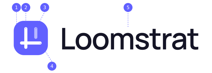
The full-color logo is the default. Switch to reverse on dark or violet backgrounds, and to one-color only when the medium has a single ink.
 Primary · light backgroundsReverse · dark backgroundsReverse · Loom Violet
 One-color ink · stamps, engraving
 Stacked · square spaces
 Mark · favicon, app, avatar
 Wordmark · mark already nearby
Keep clear space of x on every side, where x is half the mark's height. No text, edges or other logos inside that area.
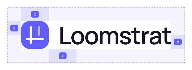
Horizontal logo: 100 px wide on screen, 26 mm in print. Below that the wordmark's counters close up.
Mark: 16 px on screen, 6 mm in print. At 16 px, keep the 55% short warp. Don't simplify it.
If a layout seems to need one of these, the layout needs fixing, not the logo.
Match the partner logo's optical height to the Loomstrat wordmark's cap height, separate them with a 1 px hairline in Ink at 15%, and keep 2x of space on either side of it. Loomstrat goes first unless the partner is the host.
PartnerDeep-navy ink on white, with one violet accent. Use violet with restraint. It marks the one thing on the page that matters most.
Click any value to copy it. CMYK values are converted from screen colors, so approve a press proof before any print run.
The neutrals lean slightly violet so they sit naturally next to the accent. Sky and Highlight are for small accents only.
Violet into sky, at 92°. Use it on two or three words of a headline, never on buttons, backgrounds or body text.
Success, warning and error appear in product UI and forms. They never decorate marketing pages.
Ratios are calculated from the hex values. Loom Violet passes for large text and UI on white. Use Violet Deep for small violet text.
| Pairing | Sample | Ratio | Body text | Large text / UI |
|---|---|---|---|---|
| Ink on Paper | Aa 123 | 17.99:1 | AAA | AAA |
| Muted on Paper | Aa 123 | 6.69:1 | AA | AAA |
| Faint on Paper | Aa 123 | 3.42:1 | Fail | AA |
| Paper on Loom Violet | Aa 123 | 4.54:1 | AA | AAA |
| Loom Violet on Paper | Aa 123 | 4.54:1 | AA | AAA |
| Violet Deep on Paper | Aa 123 | 6.02:1 | AA | AAA |
| Violet Deep on Violet Soft | Aa 123 | 5.25:1 | AA | AAA |
| Paper on Night | Aa 123 | 19.53:1 | AAA | AAA |
| Loom Violet on Night | Aa 123 | 4.30:1 | Fail | AA |
| Ink on Highlight | Aa 123 | 15.95:1 | AAA | AAA |
Manrope does almost everything. Instrument Sans sets small labels and Fragment Mono sets data and code. All three are free on Google Fonts.
ABCDEFGHIJKLMNOPQRSTUVWXYZ abcdefghijklmnopqrstuvwxyz 0123456789 & $ %
Get it on Google FontsABCDEFGHIJKLM NOPQRSTUVWXYZ 0123456789
Get it on Google FontsHeadlines get tighter as they get bigger. Body copy keeps default tracking, a line height of 1.6 and about 65 characters per line.
Headlines, buttons and nav use sentence case. Only the small Instrument Sans labels are uppercase.
Use 600 for headings. Save 700 and 800 for numbers in stat blocks, never for long headlines.
Use Fragment Mono for figures, timestamps, tokens and code. Never for whole paragraphs.
The pieces that make a page feel like Loomstrat without the logo on it: soft cards, hairline grids, flat violet buttons and calm motion.
Flat violet with a soft top highlight. Hover darkens it to Violet Deep and slides the arrow 2 px.
Bigger surfaces get rounder corners. The mark's own tile uses 7/24, about 29%.
The grid echoes the loom. Use it at 7 to 9% opacity and fade it toward the edges. One soft violet glow per hero at most.
Use Lucide line icons. Feature icons always sit on the icon tile: a squircle in the mark's proportions with a soft violet fill, drawn at a 1.75 px stroke. They fill violet on hover. Inline UI icons such as arrows use a 2 px stroke, and check marks 2.5 px. Each service and industry has one icon, used the same way everywhere.
Hover or focus a card to see each curve. Every animation respects the visitor's reduced-motion setting.
cubic-bezier(0.4, 0, 0.2, 1)
Hovers, toggles, buttons. Quick and predictable.
cubic-bezier(0.22, 1, 0.36, 1)
Panels, cards, drawers. Settles gently.
cubic-bezier(0.16, 1, 0.3, 1)
Page entrances, the logo reveal. Used once per view.
Screenshots of real Labs tools and Studio builds, cropped tight on the part that answers a question. No stock dashboards.
Founders and team in their real workspaces. Neutral grade, no heavy filters, no violet color washes over faces.
Explain with flows, timelines and grids drawn in the brand palette. Avoid 3D blobs, mascots and generic AI art.
We write like a senior partner explaining a plan across the table: specific, plain and confident enough to say no.
Name the number, the week, the source. "3 to 6 weeks", not "fast".
Short sentences, active voice, everyday words. Jargon only when the reader uses it.
Say what we won't do and what something really costs. Trust comes from the trade-offs.
No hype, no exclamation marks, no countdowns. Confidence comes from proof.
We leverage cutting-edge AI to supercharge your digital transformation journey!
Vague, inflated and says nothing a reader can check.
We scope, build and ship your MVP in 3 to 6 weeks. You own every line of code on day one.
A number, a promise and a benefit, all checkable.
Unlock powerful insights with our robust analytics dashboard.
A dashboard is a means. What decision does it help?
See which channel to cut this month, and what that frees up for the one that works.
Starts from the decision the reader is trying to make.
Oops! Something went wrong. Please try again later.
Cute, unhelpful and gives no next step.
We couldn't send your brief. Check your connection and resend it. Nothing you typed was lost.
What happened, what to do, and what's safe.
How the system comes together on the things people actually see. Use these as starting templates.
Strategy, made structural.Strategy, made structural.
Decision-first Labs products and production-grade MVPs for technical founders.
Use the 80 × 80 px PNG mark, displayed at 40 px. No quotes, banners or extra colors.
 LinkedIn, X
 App, favicon
The avatar drops the tile because platforms crop to a circle. The threads sit in the middle 52%.
Every approved logo as an outlined SVG (no font needed) and as a transparent PNG. When in doubt, use SVG.
All 14 logos as SVG, plus PNGs at 1×, 2× and 4×, a color sheet and a quick-reference README, in one ZIP.




Need a format that isn't here, or approval for a co-branded piece? Email build@loomstrat.com.